How to Read the COT Edge Analyzer
COT Edge takes the raw CFTC Commitment of Traders report, a wall of cryptic spreadsheet numbers, and turns it into a positioning read you can grasp in seconds. This guide walks through every part of the analyzer, from the single number a beginner should look at first, to the details a seasoned trader will want. No prior COT knowledge required.
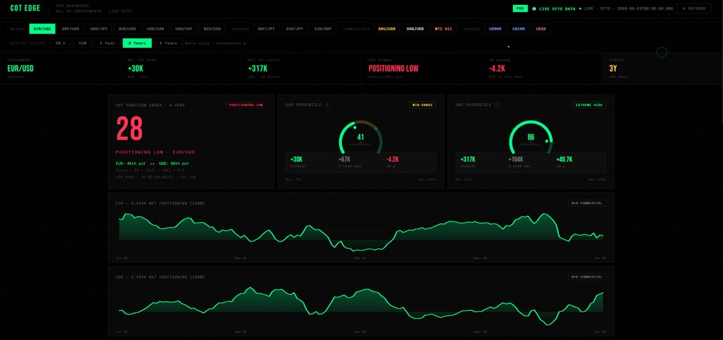
Step 1: Pick an instrument
Up top you choose what to look at: major FX pairs (EUR/USD, GBP/USD, USD/JPY and more), crosses (GBP/JPY, EUR/GBP…), commodities (gold, silver, crude oil) and the US indices (S&P 500, Nasdaq, Dow). Click any one and the whole dashboard updates to that market.
Step 2: Choose your timeframe
Right below, you pick the history window: 1W (the latest week's change), 12W, 1 Year, 3 Years and 5 Years. Everything on the page, the percentiles, the averages, the chart, is calculated against the window you choose.
If you're not sure, start with 3 Years. It's the recommended default because it captures a full macro cycle: long enough to know what "extreme" really means, short enough to stay relevant. Switch to 12W to see recent momentum, or 5Y for the widest context.
Step 3: Read the summary bar
The strip across the top is the quick read. For a pair like USD/CHF it shows:
- Net COT Base & Net COT Quote: how speculators are positioned in each side of the pair (longs minus shorts, in thousands of contracts). Green is net long, red is net short.
- COT Signal, the headline read: Positioning High, Balanced, or Positioning Low, with the percentile for each leg.
- 1W Change: how much positioning moved versus last week. The direction of the move often matters as much as the level.
- Period: the window you've selected, so you always know what the numbers are measured against.
Step 4: The COT Position Index
This is the big number on the left, a single score from 0 to 100 that blends both sides of the pair into one positioning read.

The scale is simple:
POSITIONING LOW
BALANCED
POSITIONING HIGH
A high score means speculators are crowded toward the upside of that pair; a low score means crowded toward the downside; the middle means there's no strong lean either way. It's built from the two percentile gauges next to it, so you can always see why the score is what it is.
Step 5: The percentile gauges
Each side of the pair gets its own gauge showing where current positioning sits within its history, as a percentile from 0 to 100. This is the single most useful concept in the whole tool, because a raw number means nothing without context. (We go deep on this in COT Percentiles Explained.)
- Extreme High (70–100): positioning is near the top of its historical range. The long side is crowded.
- Mid-Range (30–70): normal. Nothing stretched.
- Extreme Low (0–30): positioning is near the bottom of its range. The short side is crowded.
Each gauge also shows the current net, the average over your selected window, and the weekly change, so you see the live reading against its own norm.
Step 6: The positioning chart
Below that is the history chart: speculator net positioning over your chosen window. This is where you see the shape of the story, whether the crowd has been steadily building a position, sitting at an extreme for a while, or starting to roll over. A flat line near a record high reads very differently from one that's just spiked there.
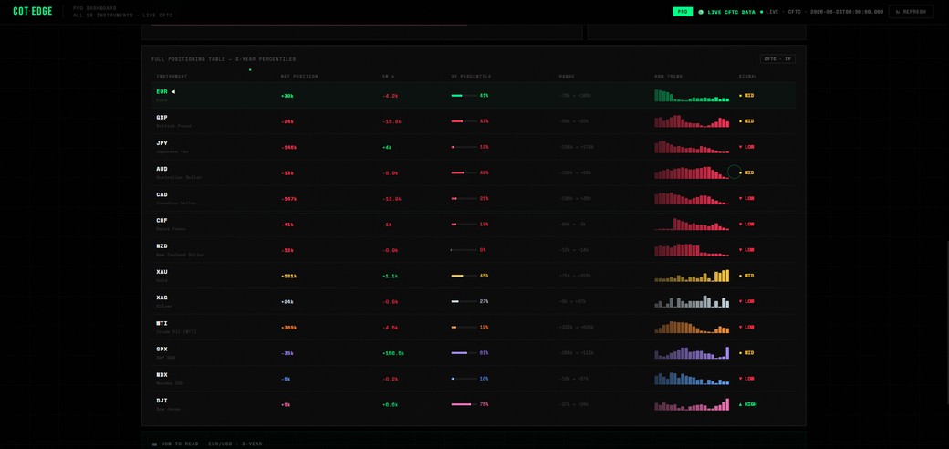
Step 7: Scan everything at once
Scroll down to the full positioning table: all 16 instruments side by side, each with its net position, weekly change, percentile, range and signal. This is the power-user view, instead of clicking through markets one by one, you scan the whole board in one place to spot which trades are at an extreme right now.
Putting it together
The whole skill is reading three things as one:
- Net position: which way the crowd is leaning, and by how much.
- Percentile: whether that lean is normal or at a historical extreme. This is the context that turns a number into a read.
- Weekly change: whether the crowd is still building the position or starting to unwind it.
If you're new
Just read the COT Signal and the gauge colors. Green/Extreme High = crowded long. Red/Extreme Low = crowded short. Grey/Balanced = nothing stretched. That alone tells you more than most traders ever bother to check.
If you're advanced
Watch the weekly change against the percentile, and look for divergence with price. A market at an extreme that's just started to unwind, or one where price stalls while positioning keeps crowding, is where the interesting setups live. (More on that in How to Use COT Data to Spot Reversals.)
Frequently asked questions
What does "Positioning High" mean?
Speculators are crowded toward one side relative to recent history. It measures how stretched positioning is, not a prediction of direction.
Which timeframe should I use?
Start with the 3-year view, it captures a full macro cycle. Use 12 weeks for recent momentum and 5 years for the widest context.
Is a high reading a buy signal?
No. A high reading means the long side is crowded, which is a risk condition, not a timing signal. Read it alongside the weekly change and price.
Open the analyzer and try it on a market you trade, three instruments are free, no signup.
Open the Analyzer →